One of natures most beautiful sense to human kind is that of vision without which life would have been like a blank paper. It is this sense of colours to the eye that brings in excitement in every aspect of its life. The understanding in right sense of balance of colours is intrinsic to interior design Today paint industries with the help of technology’s have explore a wide range of colours each of he color how ever has always been present in mother nature.
When doing up the space it is necessary to think of the house in totality, house is a series of spaces linked together. It is therefore appropriate that a common style and theme runs throughout. This is not to say that all design elements should be the same but it should work together and complement each other to strengthen the whole composition. A way to create this theme or storyline is with the well considered use of colour. Colour schemes in general are a great way to unify a collection of spaces.
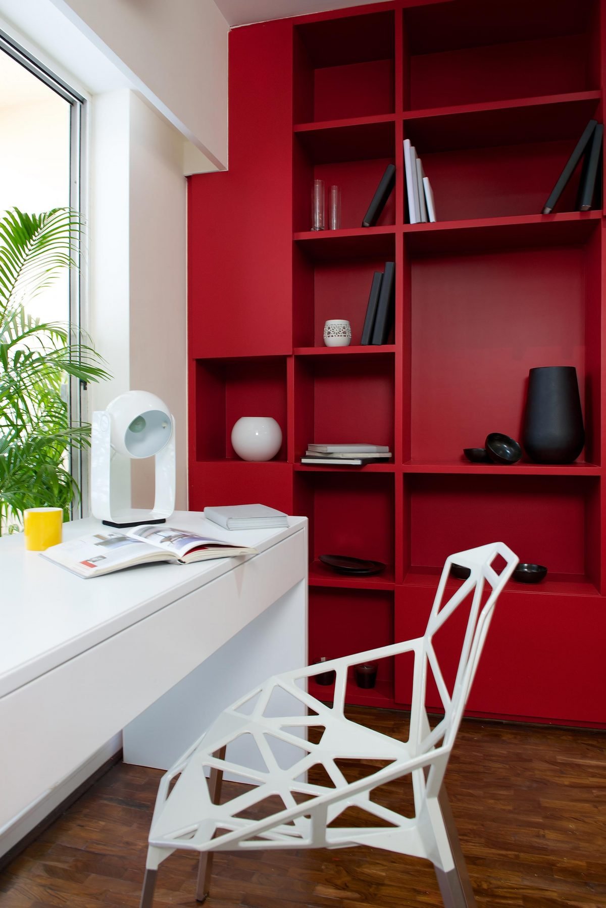
Colour plays an integral part of your decor. It has the ability to alter the perception of space in many ways – by enhancing a beautiful detail, by subduing an undesirable feature, by imposing scale or by simply compensating for the lack of architectural character.
While using colours it is important to understand the hue and the tones of the colours. Hue is described with the words we normally think of as describing color: red, purple, blue, etc. Hue is more specifically described by the dominant color’s particular gradation of color a shade or tint.
Tone. It’s how light or dark a color is, rather than what the actual colour. It’s important to realize that tones are relative, that how dark or light they seem depends on what’s going on around them. A tone that’s obviously light in one context may seem darker in another if it’s surrounded by even lighter tones.
While putting the colour scheme together small swatches of material are helpful in deciding whether colour combinations work well together. It will also make it easy to coordinate the colour scheme. For example you might pick three or four colours and use them in varying shades and materials throughout the house.
The easiest way to design a space in terms of colour is in the ratio of 60-30-10, Its the human tendency to see an overall theme in the 60 percent hue, unifying the coloration. The 30 percent provides visual interest and the 10 percent, provides that little spark of sparkle,
Translated to a room setting, it means:
60% of the room’s color is the walls
30% of the room’s color is the upholstery
10% of the room’s color is, say, an accent piece or a floral arrangement.
It would be best to layer your house with different colours and textures through furnishing and rugs accessories.
To make your house feel fresh and bright you don’t necessarily have to use the colours dramatically or in a big way; you can use the neutral colour scheme and just accent your decor with them…
This year the deeper palette is in trend, accentuated with a throw of bright colours,metallics could be used for accent.
With neutral there is a trend toward moving away from the traditional neutral colours of cream and beige,
Great neutrals colours to use are charcoal gray/faded black, off-white, and linen, although most gray hues are popular to use right now.
You can bring in the Accent through various ways like a wall art sculpture. lights, rugs wall paper, piece of furniture and accessories.
The most likely colour which you could use as a accent are natural berry purple, cherry red, lettuce green, burnt orange, pink Honeysuckle
